Custom Content Information (For Staff)
Hello potential staff member!
For the first time ever, applications are open for custom content makers, and we want to thank you for opening this link and checking out the job description.
To keep everything as uniform as humanly possible, we try to give our content makers with the same tools. We understand that some people may turn to custom content making as a create outlet, but I do want to mention early on that certain settings are required to make content for Idolise. This will not be everyone's cup of tea... But if you are still interested, here's everything you need to know.
We recommend reading everything on this page, but if you are returning and looking for a specific section, the following links will help you:
Idolise Fonts
Lauren Script - Level, Mini Mastery, Display Icon, Era Mastery
Stars From Our Eyes - Mastery Badge
Roadway - Mastery Badge
04b24 - Pixel Font (Everything except for Display Icons)
Idolise Templates
Templates are named for alphabetical ease. They'll settle at the top of a folder if you have everything in one place.
The main base templates you need will always be available from the /templates folder.
Additionally, Era Mastery badge makers and Custom Mastery badge makers will need to make use of our deck templates for color picking! Luckily, whether a deck is released or in upcoming, we do have a deck template table here!

Crop & Resize Settings
I think the most important thing in badge making is how the image looks when it is resized. The original Photoshop resize settings that are in place can cause smaller images to look extremely sharp, even if you haven't done anything on your end to cause it.
Rather than using the 'W x H Resolution' crop, we want to use the ratio crop and resize manually throug the Image > Image Size menu.

It's very easy to add an Action in photoshop to resize your image. But it's important to have the right settings when resizing.
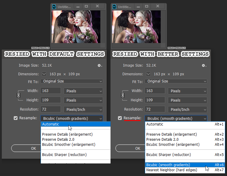
On the left, we have an image that has been resized with Photoshop's default settings. The quality has not been preserved at all, and the edges look sharp and clunky.
Unless you have already changed your settings, your Resample drop menu should currently say Automatic, which are the same settings that the W x H x Resolution crop tool uses.
On the right, we have used the Bicubic (smooth gradients) resample option, which keeps the quality of the image. Notice how smooth the colors and lines are?

This is extra information, but I also find that cropping and resizing this way will make it a lot easier for you to lighten images with easy methods, should you think the image needs it.
Because the photo of Twice does not need it at all, I thought I would use an old example from my music video deck tutorial!
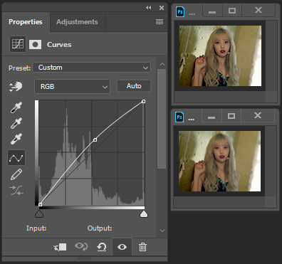
The top resize is with the default settings, and the bottom image is with our required settings. You can see that it's very easy to maintain the smooth quality while adding a little brightness with curves.
You can (hopefully) see how sharp and dark the lines are with the default settings.
In terms of where your crop should begin and end -- for badges that feature 1 person, I normally crop above the hairline. I think that the top of the head is usually the least important thing, unless a hat or over-the-head heart is involved. For group photos, I crop in what ever way means that everyone in the photo is included in the badge. That really is my only thought.
If you do want to look through badges that I've made as a reference, I recommend the Dream Deck badges gallery.
Type-Specific Information
Before we jump into this -- let me start by mentioning that in the first six months of Idolise, I was making badges all by myself with no one else to judge me. Some templates from old custom content may have a lot of extra layers inside of them. Think nothing of it. It was me. I just want to come clean.
Although it is not needed that you know how to make every type of badge, it is recommended should you become a full-time maker. This will allow you to help out your fellow makers when they are busy and need it the most!
Custom Mastery Badges
Custom mastery badges are quite straight forward. Instead of creating a new template on the fly, I suggest grabbing the original mastery badge from our templates page and making a few changes to it.
The only difference between the original badge is the "mastered" font size, and its position. The original font is 20px, but I change it to 16px. You can do this quickly by pressing T, highlighing the text and clicking the changed toolbar up top. I just use my scroll wheel to go down 4 px, since I find this easiest to avoid making mistakes!

Then, using my arrow keys while I'm selected on my "mastered" text layer, I move the layer down 1px. This can often look strange on music video era mastery badges, because the text seems high, but I promise it's exactly where it should be!
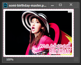
Add the user's name before the word mastered, and CTRL + Shift + S to bring up the save menu. The badge should be somi-birthday-master. I just remove master and quickly replace it with the name! Save your PSD and the PNG, and you're ready to move on!

Era Masteries

I don't know why, but I absolutely love making these badges. I think that Lauren font looks so pretty on the large template, and I do often regret not using it for all of our mastery badges.
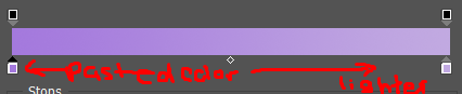
That being said, when creating a brand new template, I do have a few tricks to make things simple for you. The eyedropper tool would likely cause you grief if you did attempt to color match the lighter gradient color with it, but fear not! Because you will never have to.
As mentioned a few times in this tutorial, we keep all of our templates safe and display them right here. If a new era is finished, open the badge from that era and steal the colors!

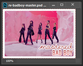
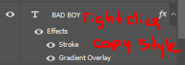
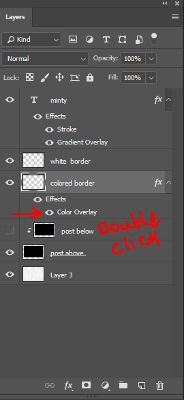
This is the Bad Boy music video badge. If you right click on the border layer, you will be given the option to copy the layer style!

Move over to the Era Mastery template and right click the dotted border. You should be able to paste the layer style this time. Repeat the same step for the text!


In this case, as I felt that the image provided was going to be a little too tight for the badge, I cropped just a little out of bounds. This is something I had mentioned above for the level badge, that there is quite a bit of wiggle room around the border. Just because it was on my way, I thought I would mention this obvious thing.


In situations where a member's name has white space, we do take the extra few seconds to add a little white under it. I recommend just taking a small pixel brush and adding a little white to your image layer.

In terms of the artist pixel text, I do not often move this up or down. Just left and right. There is at least one time that I have moved the group name and it is because I felt that there wasn't really enough space to the left.

But in most cases, I keep the pixel text quite close to the cursive.


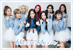

Another happy member!
Display Icon

Display icons are incredibly easy, as it is just a color change to the name and border!
Depending on the name of the person, the cursive font can cause a little bit of confusion. Although by default, the font is centered, it may still appear that maybe it's skewed one way or another. If their names ends in a Y, I think that the tail can really throw off the look so I will often measure with the select tool (after moving the font left or right a few px) to see if I have it fairly centered.

This step is really not needed and it is just me being fussy, so please feel free to ignore.
In this case, Minty asked that I specifically use the same color as Melinda! But in most cases, I will pick a color from the badge that I find appealing and non-blinding. I find it easier to start with the border color for some reason, so that's what I have done here!

By copying your border color, you have it for the top color of the text gradient!

Swap out the name, and that's it. Another finished badge? Just like that? Nuts.